Step 2 of 8 · Now
Talk to 5 people who have it
We believe junior designers feel this often enough to want it gone.
We’ll know when at least 3 of 5 describe a recent time it cost them.
Brand manual · v1 · November 2026
One page for everyone who makes something with the name on it: the app, this site, the film, a slide. The values here are the same tokens both apps build from.
Logo files and tokens01
Launchi helps people who build with AI actually launch, by making sure they never do it alone.
Don’t launch alone.
The brand idea in three words. Most ideas don’t fail; they go quiet, because nobody else was waiting for them. Launchi is the someone.
For people building products with AI tools who haven’t launched yet, Launchi is a twelve-week launch mentor: an idea becomes a plan with the riskiest step first, every step closes with proof, and a pod of builders with a coach who has launched expects a ship-in every week.
Riskiest step first
Start where you’re most likely to be wrong, while being wrong is still cheap.
Proof, not promises
A step closes with something to show: a note, a link, a commit.
Never alone
A pod that ships every week and a coach who has launched.
Not a builder. Bring any tool.
Not a guru, not a course.
Not hype, not a leaderboard.
02
Say it like launch, then ee: LAUNCH-ee
One word, capital L, the rest lowercase.
No caps, spaces, hyphens or camel case.
In running text, the name is just a word in the text face.
Don’t drop the logo into a sentence.
The wordmark is Bricolage Grotesque Bold at −0.04em, outlined, so it looks the same everywhere. The domain is launchi.app; write it in lowercase.
03
The mark is a launch pad seen from above: a ring, and the craft just leaving it.
A launch pad seen from above: a ring, and the craft leaving it. Everything sits on a 20-unit grid; the bar is twice the ring’s stroke.
Two tones only. On dark, the ring turns volt and the rest goes white; on any light color, it’s all ink.
Don’t stretch or squash it
Don’t rotate it
Don’t fill it with gradients
Don’t add glows or shadows
Don’t retype it in another font
Don’t put ink on dark
Don’t pull the bar out of the ring
Don’t outline it
04
Warm paper and ink carry the page. A few saturated launch colors carry the feeling, and volt carries progress.
Most of every screen. Warm paper, never pure white for the page; near-black ink, never pure black for text.
Paper
paper
The page
Card
card
Cards, fields
Wash
wash
Quiet fills, hovers
Rule
rule
Dividers
Rule strong
rule-strong
Field borders
Ink
ink
Text, primary buttons
Ink 2
ink-2
Body copy, secondary
Ink 3
ink-3
Meta, hints
Night
night
The film, dark lockups
Saturated and few. Volt means progress: the current step, the main action, a win. The others tint people, auras and illustrations.
Volt
mark
Now, the main action, wins
Volt deep
mark-deep
Volt button edge, underlines
Volt soft
mark-soft
Current step fill
Sky
sky
Aura, the pod, calm
Sky soft
sky-soft
Info fills
Coral
coral
Streak fire, Maya, warmth
Coral soft
coral-soft
Warm fills
Sun
sun
Shipped weeks, highlights
Lilac
lilac
The coach, aura
Meaning only. Green is proof that something happened; orange is a missed week or an error. Never decoration.
Proof
proof
Verified, done text
Proof bright
proof-bright
Done segments, rings
Proof wash
proof-wash
Done badges
Alert
alert
Missed, errors
Alert wash
alert-wash
Error fills
Roughly how a Launchi screen divides its color. Volt stays small, so it still means something.
Every pair here passes WCAG AA for body text (4.5:1). Ratios are computed from the tokens when the page builds.
These fail. The colors are fine; the pairing isn’t.
Volt on Paper
Volt is a fill on light. Put ink on it.
Coral on Paper
Use coral for icons and fills, ink for words.
Sky on Paper
Sky is for auras and tags with ink text.
White on Volt
Volt buttons always take ink.
Proof bright on Card
Bright green is for bars and rings; done text is Proof.
05
A loud display face, a quiet text face, and a mono for what machines count.
Display
Aa
ABCDEFGHIJKLM abcdefghijklm 0123456789
Bricolage Grotesque
Wide-shouldered and a little quirky. It does the shouting, so everything else can be calm.
Text and UI
Aa
ABCDEFGHIJKLM abcdefghijklm 0123456789
Schibsted Grotesk
Plain and sturdy at small sizes. Reads like a person talking, not a brochure.
Hashes and numbers
Aa
ABCDEFGHIJKLM abcdefghijklm 0123456789
IBM Plex Mono
Only for things a machine wrote or counted: commit hashes, week numbers, ratios.
Display sizes are fluid between their phone and desktop values. Tracking tightens as size grows.
Display
Bricolage 700 · 52 to 112 px · 0.9 · −0.05em
Don’t launch alone.
Headline
Bricolage 700 · 34 to 60 px · 0.98 · −0.04em
Most ideas go quiet.
Title
Bricolage 700 · 28 to 34 px · 1.02 · −0.03em
Close each step with proof
Section
Bricolage 600 · 20 px · 1.2 · −0.02em
This week’s ship-in
Lead
Schibsted 400 · 17 to 18 px · 1.6
You already have the idea and the AI tools to build it.
Body
Schibsted 400 · 15 to 16 px · 1.6
A step is done when there’s something to show: a note, a link, or a commit.
Label
Schibsted 600 · 14 px
Working name
Eyebrow
Schibsted 600 · 13 px · caps · +0.12em
How the 12 weeks work
Meta
Schibsted 400 · 13 px · Ink 3
Reviewed by Alex on Tuesday
Mono
Plex Mono 400 · 13 px
a41c9e2 · week 04 · 3/8
Sentence case everywhere, headlines included.
Title case and caps make it shout.
Mono for what a machine counted.
Mono is not a style for headlines or buttons.
06
Phosphor duotone, one family, where the weight of an icon tells you its state.
Phosphor, duotone by default. One family only, so every icon has the same stroke and the same soft second tone.
Duotone
The default, and anything happening now.
Fill
Done, verified, playing. Settled things.
Regular
Later and locked. Not yet yours.
Bold
Small arrows inside buttons only.
16 inline with small text, 18 in buttons and proof lines, 22 in a 40 px step badge, 28 and up for showcase only.
An icon names a real thing: a commit, a step kind, a streak.
Sparkles and wands say “AI magic”. We say what happened.
07
A small, fixed cast of illustrated people. Launching is about people, so the brand shows them.
Open Peeps by Pablo Stanley (CC0), drawn by DiceBear. Each character keeps one look; only the face changes. The expressions below are every face the brand uses.
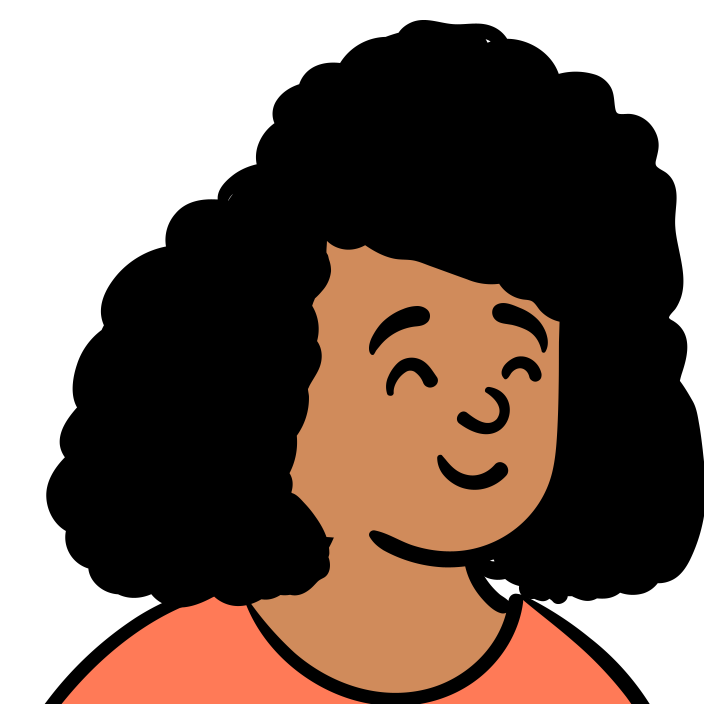
Maya
The builder. A designer with an idea; the film follows her twelve weeks.
#d08b5b#ff7a57
calm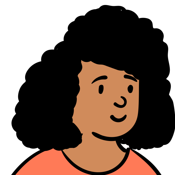 smile
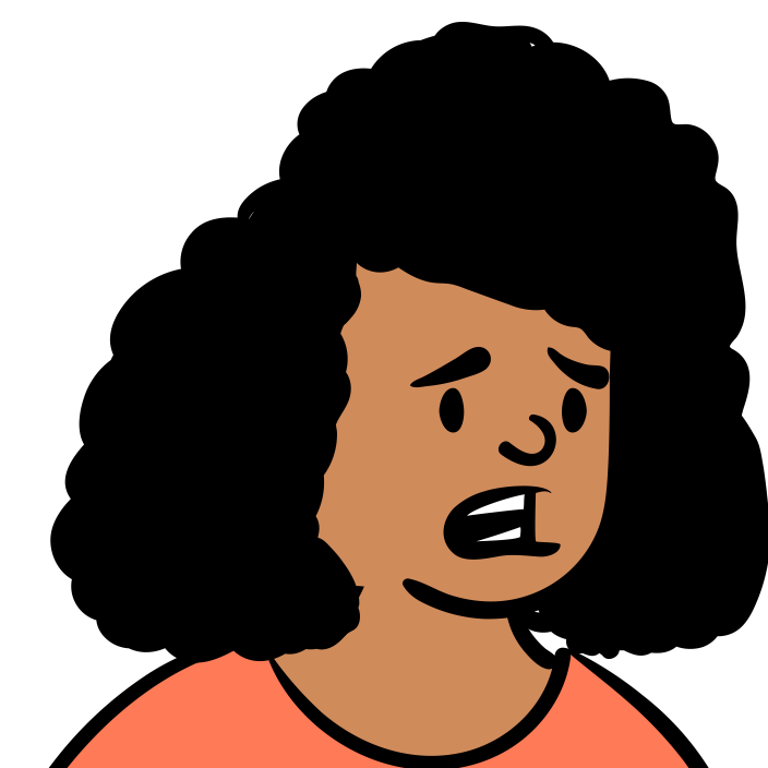 concerned
 concernedFear
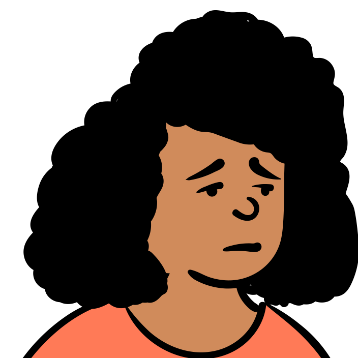 tired
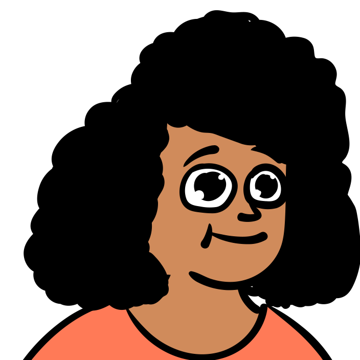 awe
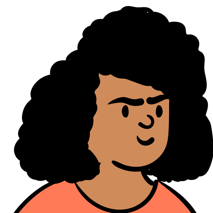 driven
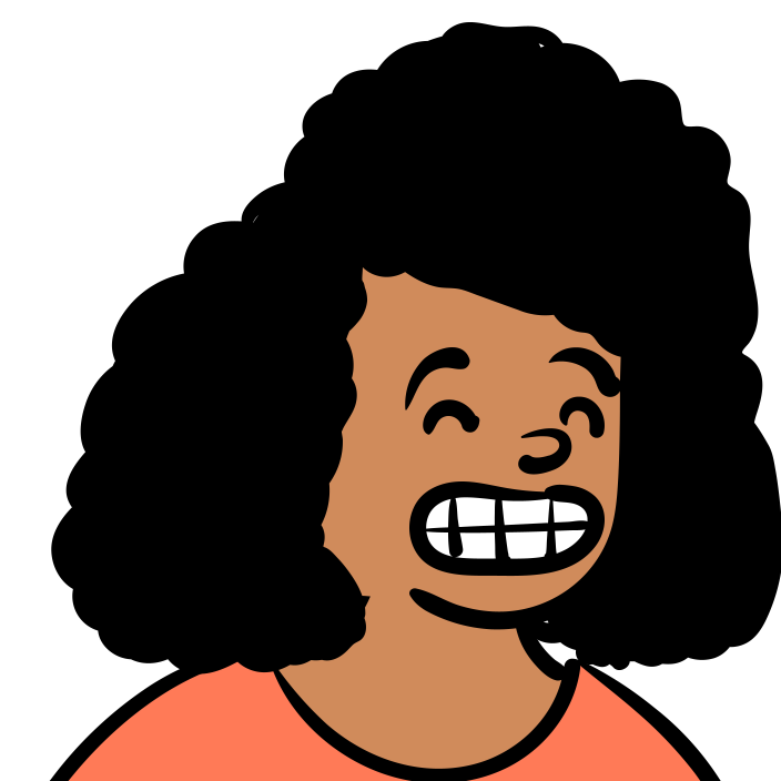 smileBig
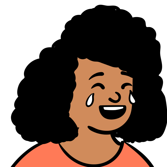 smileLOL
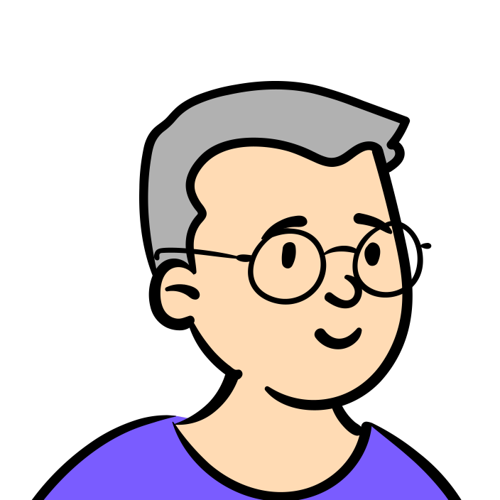
AlexCoach
The coach. Has launched before; reviews, confirms, points at the next step.
#ffdbb4#7a5cff
smile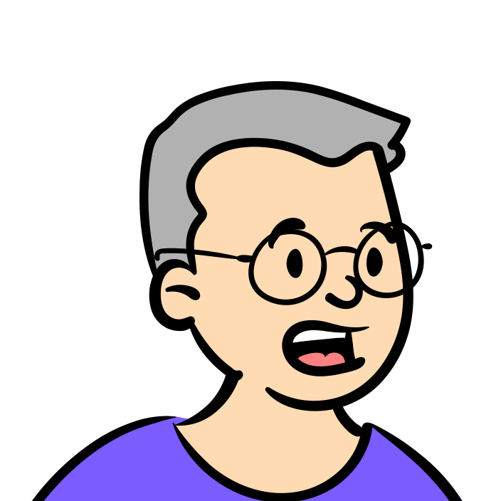 explaining
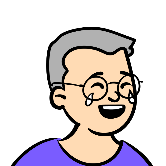 smileLOL
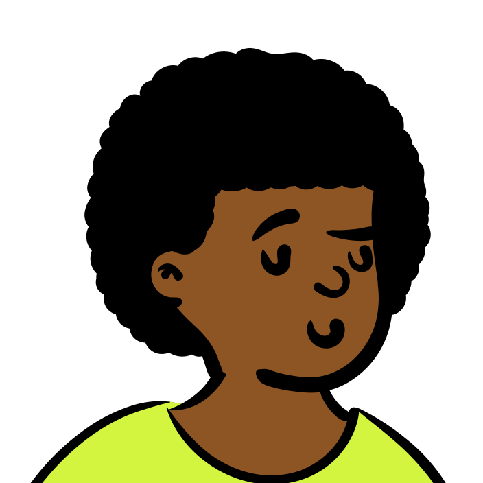
Sam
Pod. Shipped last week, says so.
#8d5524#d4f53f
cheeky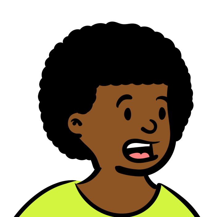 explaining
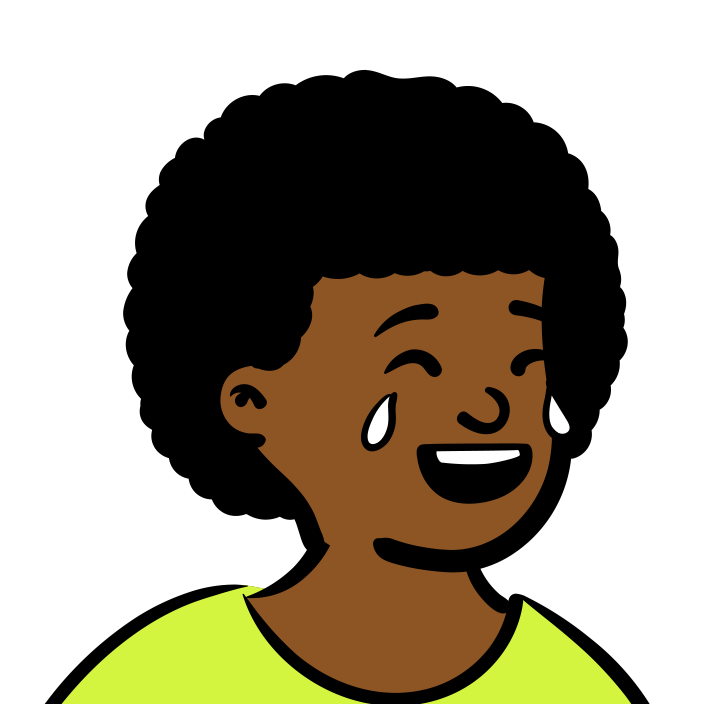 smileLOL
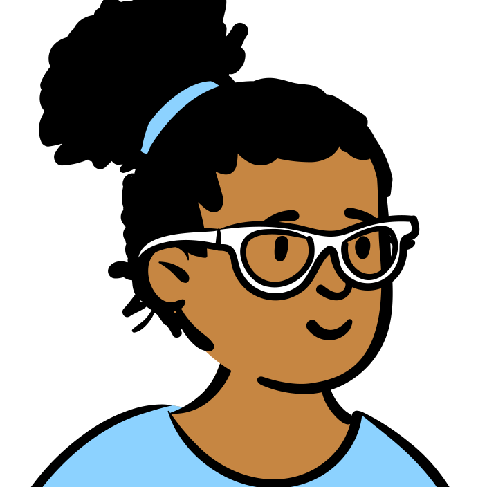
Priya
Pod. The first person who would pay.
#c68642#8cd2ff
smile explaining
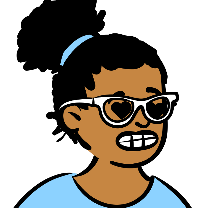 lovingGrin2
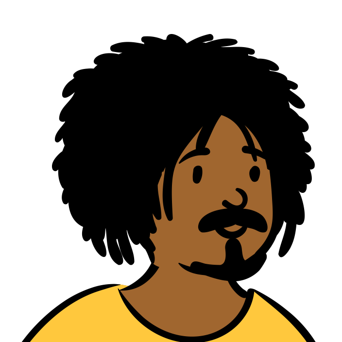
Jordan
Pod. Knows the market, answers the copycat doubt.
#a0662f#ffc83d
smile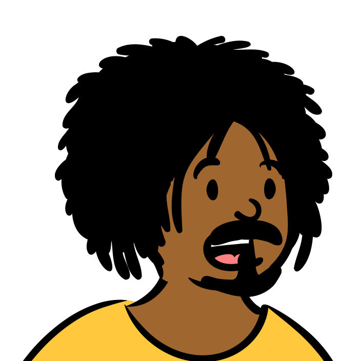 explaining
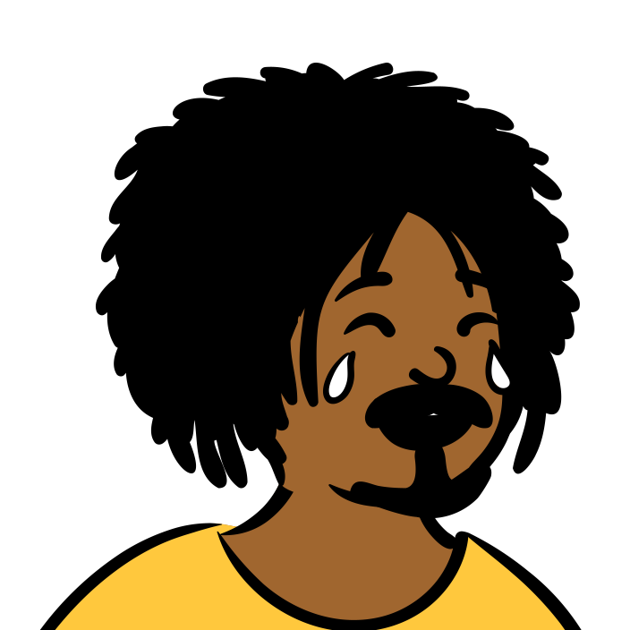 smileLOL
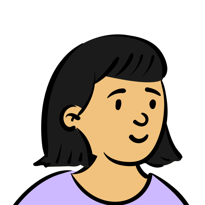
Mei
Pod. Always first with her ship-in.
#f1c27d#cdb9ff
smile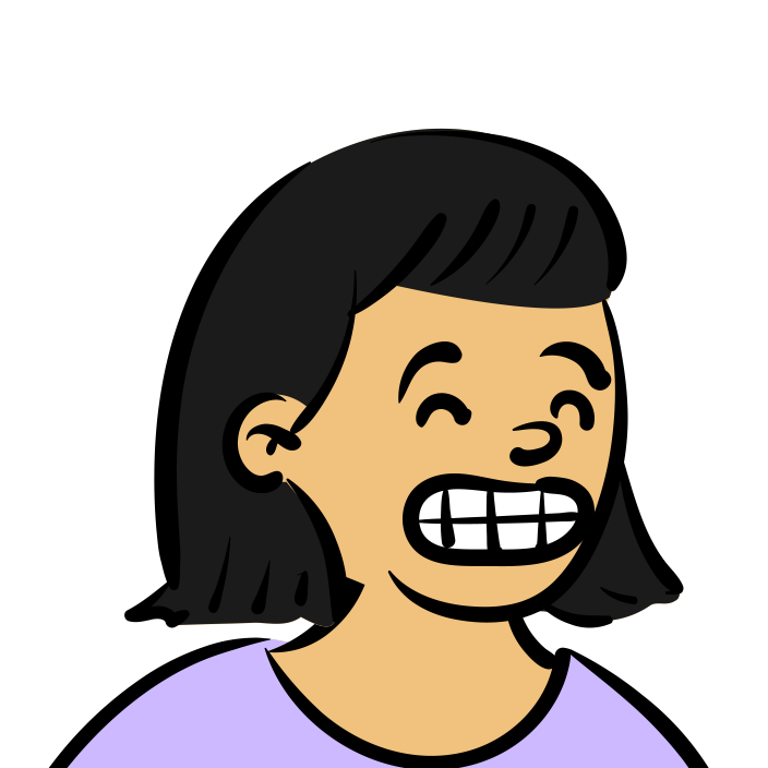 smileBig
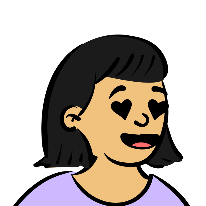 lovingGrin1
Faces carry the story, so pick them in order. Worry comes before relief; a big laugh is saved for a real win.
The ideaThe doubtsAloneThe callThe weeksShippedLaunchFull figures at hero sizes; a circle crop with a white ring at avatar sizes.
New people dilute the cast. Generated ones look like everyone else’s.
The look is the person.
Real users deserve their own words; illustrations are never testimonials.
08
Quick out, soft landing. Things rise in once, buttons press, and confetti waits for a real win.
Motion shows progress and people. It never decorates an empty moment, and it never makes anyone wait.
Out, soft landing
cubic-bezier(0.22, 1, 0.36, 1)
| Name | Time | For |
|---|---|---|
| PressA button going down 2 px | 100 ms | A button going down 2 px |
| QuickHover, color, a chip appearing | 200 ms | Hover, color, a chip appearing |
| RiseContent arriving on scroll, cards, stamps | 550 to 700 ms | Content arriving on scroll, cards, stamps |
| CelebrateRings filling, counting up, confetti | 900 ms | Rings filling, counting up, confetti |
| DriftThe aura behind the page | 22 to 34 s, looping | The aura behind the page |
Press
Buttons sit on a 3 px edge and go down when pressed.
Rise
14 px up and in, once, the first time it’s seen.
Celebrate
Confetti is earned. This button stands in for approving a plan.
A win is something that happened: a plan approved, a ship-in shared, a first user, launch night.
If it fires for clicks, it means nothing when it fires for a launch.
The proof is the reward; the motion just points at it.
Missing a week is information, not a failure.
When someone asks their system for less motion, Launchi listens everywhere, not just in CSS.
09
A synthesized score: doubts sound low and uneasy, the pod sounds warm.
The film’s score is written in code with Web Audio: oscillators, filtered noise and envelopes, through one gentle compressor. No audio files. The doubts get a low, uneasy drone; the pod gets warm chords in D major.
Never autoplay.
Sound starts only when someone asks for it, and a mute is always one tap away.
Every sound has a picture.
Nothing is said only in audio; the film works on mute.
Short and soft.
Cues are under a second, except the doubts’ drone, the chords and the crowd on launch night.
One key.
Chords and plucks stay in D major so the film’s cues feel like one piece.
10
A plain peer who has shipped. No hype, no em dashes, no emoji, nothing we can’t back up.
A peer who has shipped
Talk like the person in the pod who launched last year: plain, warm, a little dry. Not a guru, not a cheerleader.
Say the next step
Every message should leave the reader knowing what to do now. One step, in their words.
Proof over adjectives
Name what happened: the commit, the five calls, the first dollar. Don’t praise it with words like amazing.
Honest about effort
Launching is uncomfortable. Say so. Never promise it’s easy, fast or guaranteed.
A step is something you can do tonight.
Missed is information. Give one way back.
The proof is the praise.
Say what it is. Leave out the buzzwords.
Ask the way a friend would.
Explain the idea, not the machinery.
The voice stays the same; the tone moves with what the builder is going through.
11
The app’s building blocks, drawn here from the same code.
Chunky and pressable: each sits on a 3 px edge of its own darker color and drops 2 px when pressed. One volt button per view, for the step that moves you forward.
White on paper, a strong border, and a volt focus ring. Labels sit above, hints below; questions are set in the display face.
.box
Solid card
White at 90%, a white edge, a soft long shadow. The default container.
.glass
Frosted card
For small things floating over the aura: chips, a commit, a note.
The heart of the product. Kind badge, title, the belief the step tests, how you’ll know, and its proof.
Step 2 of 8 · Now
We believe junior designers feel this often enough to want it gone.
We’ll know when at least 3 of 5 describe a recent time it cost them.
Step 6 of 8 · Done
12
SVGs, outlined, cropped with clear space. Pick the file for the background it will sit on.